I’m a generalist, and I’ve worked in all phases of the product cycle, from strategy and discovery, to production and shipping features. My interest is in building software that is ethical, meaningful, useful, and accessible.
Summary — ☺
- Led design in a developer tool used at Uber, Salesforce, Intel, Toyota, and others
- Experienced redesigning complex products with big, live user bases
- Established design practice in organizations
- Generalist who can contribute from strategy to design to leadership
- Principal-level IC / product strategist
Semaphore CI · Principal Product Designer · 2016–21
Semaphore is a tool for developers used by engineering teams at Uber, Salesforce, and Intel, and many others. I was in command of product design for slightly under five years.

This page is the principal point of interaction between developers and Semaphore. It tells them how their latest batch of work is doing and if it’s ready to be merged into the codebase.
My Role
I focused solely on product, from product strategy and figuring out what customers want, to building features. I spent my time between strategic and individual contributions, and running a small design team of 3.

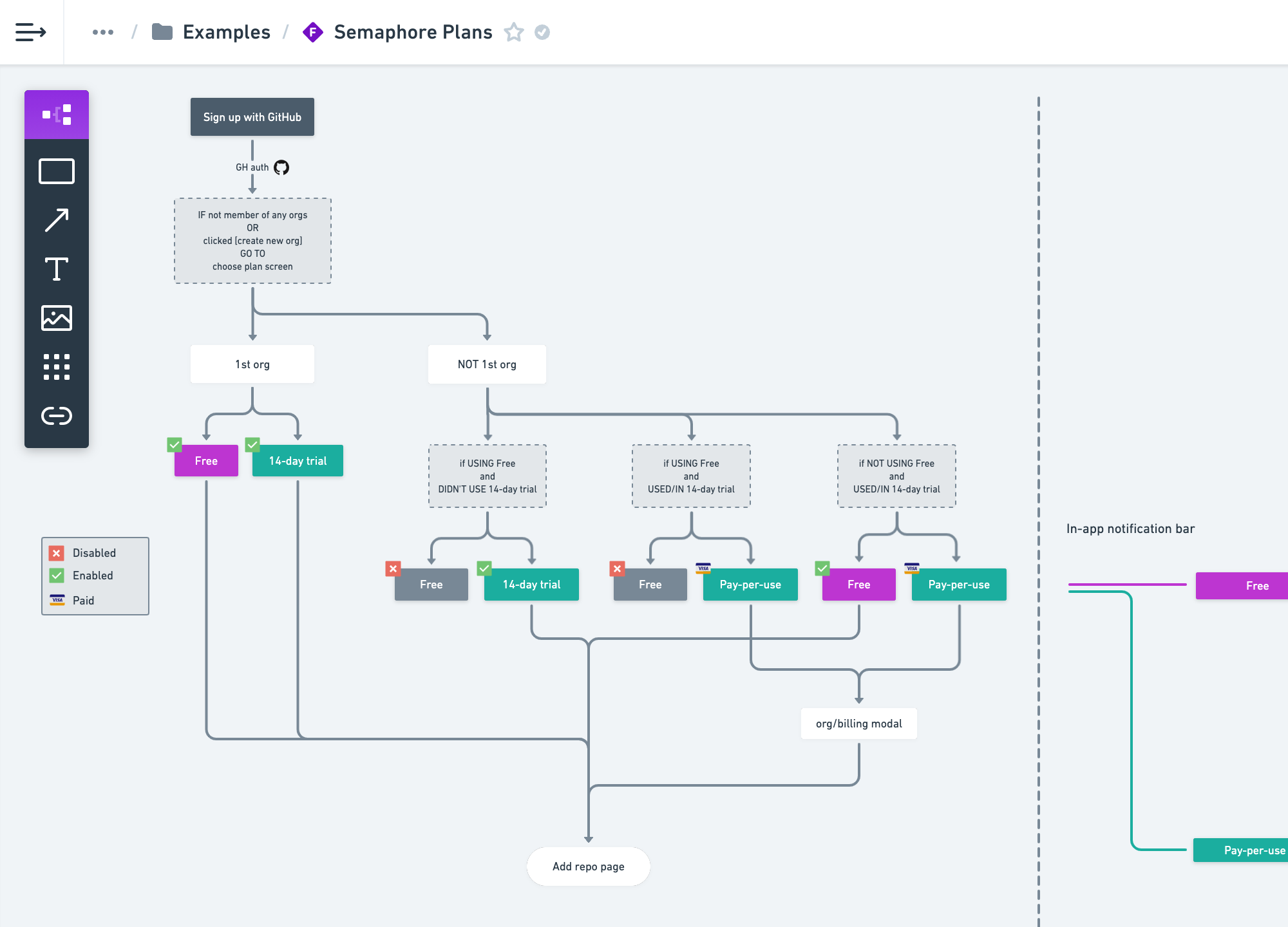
In recent years, I’ve been heavily relying on Whimsical for high-level design. Often the engineering team would use these flowcharts later as the foundation for designing specs.
Tools
I use whatever makes the most sense at the moment. For thinking it’s pen & paper. I like Balsamiq and Whimsical for structural design. Deeper down the process it used to be Sketch, now it’s Figma. Sometimes I design directly in code.

Setting up continuous delivery is a daunting task, even for experienced developers, and onboarding was always an area of our team’s special attention.
As part of the design system, I developed a simple illustration framework. The idea was to ease and relax the user onboarding and breathe life into tedious, technical explanations.

These illustrations appear in various places around the app, usually blank slates and onboarding pages, and wherever we felt it would make the experience slightly nicer.
The Challenge
A generous portion of my efforts went on understanding the domain so distant from my reality. To figure out what developers want from the software. But also to learn what excites their team leaders and makes them choose one thing over another.

Working on a complex product teaches humility. I had to step back and carefully listen and learn from my fellow developers, users, and everybody else who could help me understand what the hell we were trying to make.
The Process
Design worked in a tightly coupled relationship with customer success, using a combination of (a) Simple stats, (b) Business metrics, and (c) Customer interviews. The goal was to figure out what brings the most value for both our customers and our business.

We were learning how to improve by looking at numbers and regularly talking to the customers.
During my tenure, we released a massive product redesign. Deep relationships with engineering teams from Intel, Toyota, Salesforce, and others, inspired us to build an entirely new product. We operated through a strong feedback loop with our customers, and product design was a fundamental piece in the process.
@semaphoreci Just had the Semaphore CI re-design rolled-out to my UI, I think this might the only case I have ever seen where a re-design has improved everything. Nothing has gone backwards or is bothersome. That's how to do a re-design, loads of subtle improvments & polish.
— Sean Hinton (@SeanHinton18) April 6, 2021
…and I think this might be the only case I have ever seen someone praising a redesign. I promise this person is neither my friend nor relative.
In 2017, the marketing website I designed won the Typewolf’s site of the day award for good typography. Shortly after, we outsourced all work on marketing pages so I can focus on the product. I didn’t work on the current websites and other public-facing pages.
Super · Senior Product Designer · 2015–16
Super is trying to tackle the problems of homeownership with technology. It had a successful takeoff on Product Hunt in late 2015. I joined soon after as a senior designer.

Super is a boring app on its own, but the business proposition resonates well with home owners — Subscribe and protect yourself from unwanted expenses.
My Role
As designer number two, I helped with establishing the early design language. My contributions spread from designing web and mobile apps, marketing pages, to building design foundations in the frontend. I developed on top of BassCSS toolkit, one of the earliest attempts at functional CSS.

I developed and set up a design system using BassCSS, a pioneer project in functional CSS. We evolved the design system on top of it.
Super is a simple product of limited technical complexity. The focus of my work was entirely on execution and hands-on design. The real challenge was on the business, to figure out how to disrupt and unlock the traditional insurance market.


Eventually, we parted ways in slightly under a year. It was a sweet experience and great people, but I felt the need to work on more exciting problems.
Active Collab · Principal Product Designer · 2013–15
I led a 2-year long major redesign of this beast project management tool that does everything from tasking and budgeting to time tracking and invoicing. Teams from Apple, NASA, Microsoft, Nike, White House, and others, use it to organize their projects.

Invoicing system is one of the building blocks of the app. It syncs time tracking from tasks and projects, and making it all work seamlessly wasn’t a trivial design challenge.
My Role
I joined specifically to try to reverse the experience rot. At the time, the software had entered the phase of maturity and slight negligence. It resulted in a feature creep and severe challenges for future growth. My role was to untangle the mess.

Early exploration and sketching. Pen & paper is a handy companion for thinking but of limited value in a team setting. Nowadays, I prefer to share Whimsical flowcharts, Google docs, or a prototype in a browser.
The Challenge
The difficult task was to make cuts and shut down many underused features. To soften the impact of such destructive decisions, we relied on usage statistics, user feedback, and open communication with our customers.

One of the principal pages, where contributors land on every day to catch up with updates, and see what’s on their plate.
Less than 10 people worked on the redesign. I worked daily with the founders on strategy to move forward. But also, I worked very closely with engineers during the entire process.

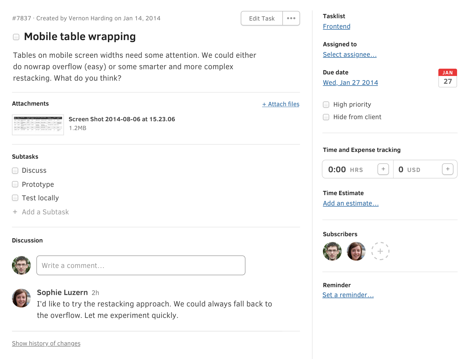
Task, the central item in the app, is interconnected with all other systems. Even though it might seem like any other to-do app, its “ambition” to communicate with every part of the system made it incredibly complex.
As early as possible, we started running our real projects on a barely usable product. Using what we were building exposed rough edges and gave us obvious directions on what to improve next. In under two years, we rebuilt the system and established the structural foundations still in use today (2021).

The calendar is just another view. It behaves like a regular calendar that interacts with everything with a due date, like tasks or invoices.
The redesign proved a great success, and it showed in the business metrics immediately after the launch. The revenue from the cloud service doubled in the following year and continued to progress at a steady pace. Part of the credit goes to the redesign that sparked and re-energized the entire company.
What I do
As a generalist, I’ve been working in organizations up to 50 people, with wide array of duties. I can help both on a strategic and hands-on level.
Things I can help with —
- Product strategy
- Connecting business and product
- User research
- Prototyping and structural design
- Writing specs
- Visual design
- Writing UI copy
- Icons and illustration
- Guiding engineers in design implementation
- Hiring designers
- Running a design team
- Mentoring
I thrive the most as an individual contributor, but I can be productive on many levels, depending on the size and structure of the organization.
Thanks for coming down this far! ✻ Go back to top